Case Study
7 min read
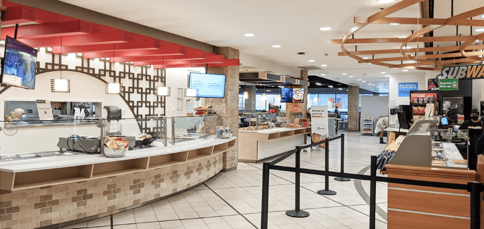
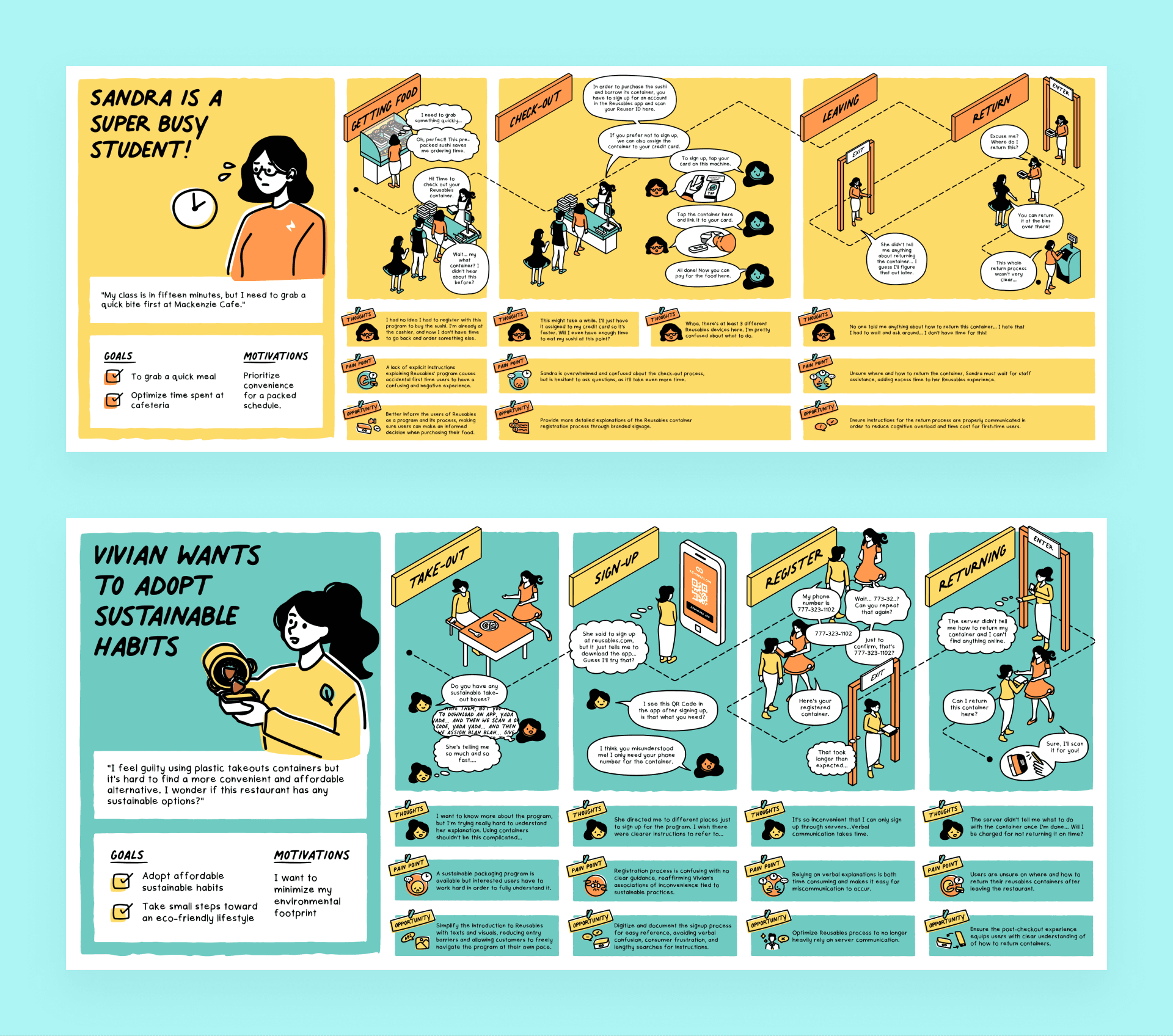
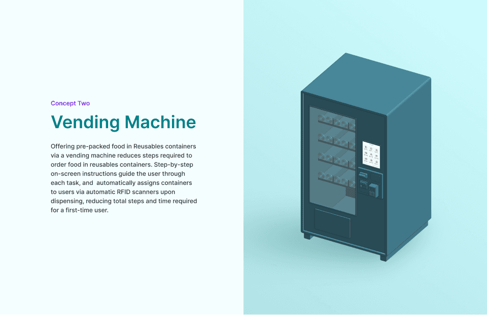
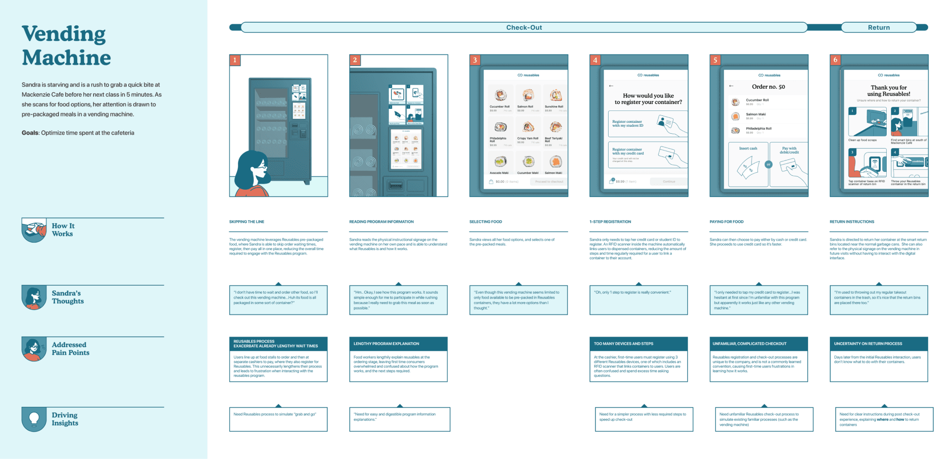
Reusables is a sustainable packaging initiative that offers reusable containers to reduce single-use waste in campus cafeterias. However, the program requires extra steps which leads many first-time users to perceive it as inconvenient. To address this, we designed a Smart Vending Machine that dispenses food in Reusables containers and guides first-time users through the registration and return process.

My Responsibilities
✒️
Created user flows and high-fidelity mock-ups, and established design systems for prototyping.
🦜
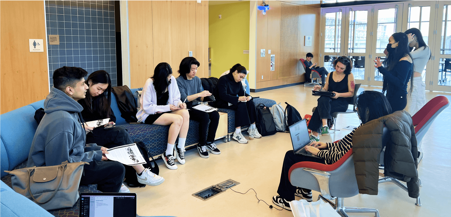
Facilitated user interviews, design ethnography, journey mapping, and participatory workshop.
🎨
Designed container labels and the vending machine blueprint, ensuring accessibility for all users.
✍️
Led visual design efforts and created vector and human illustrations using Figma and Adobe Illustrator.
BACKGROUND
Who is Reusables?
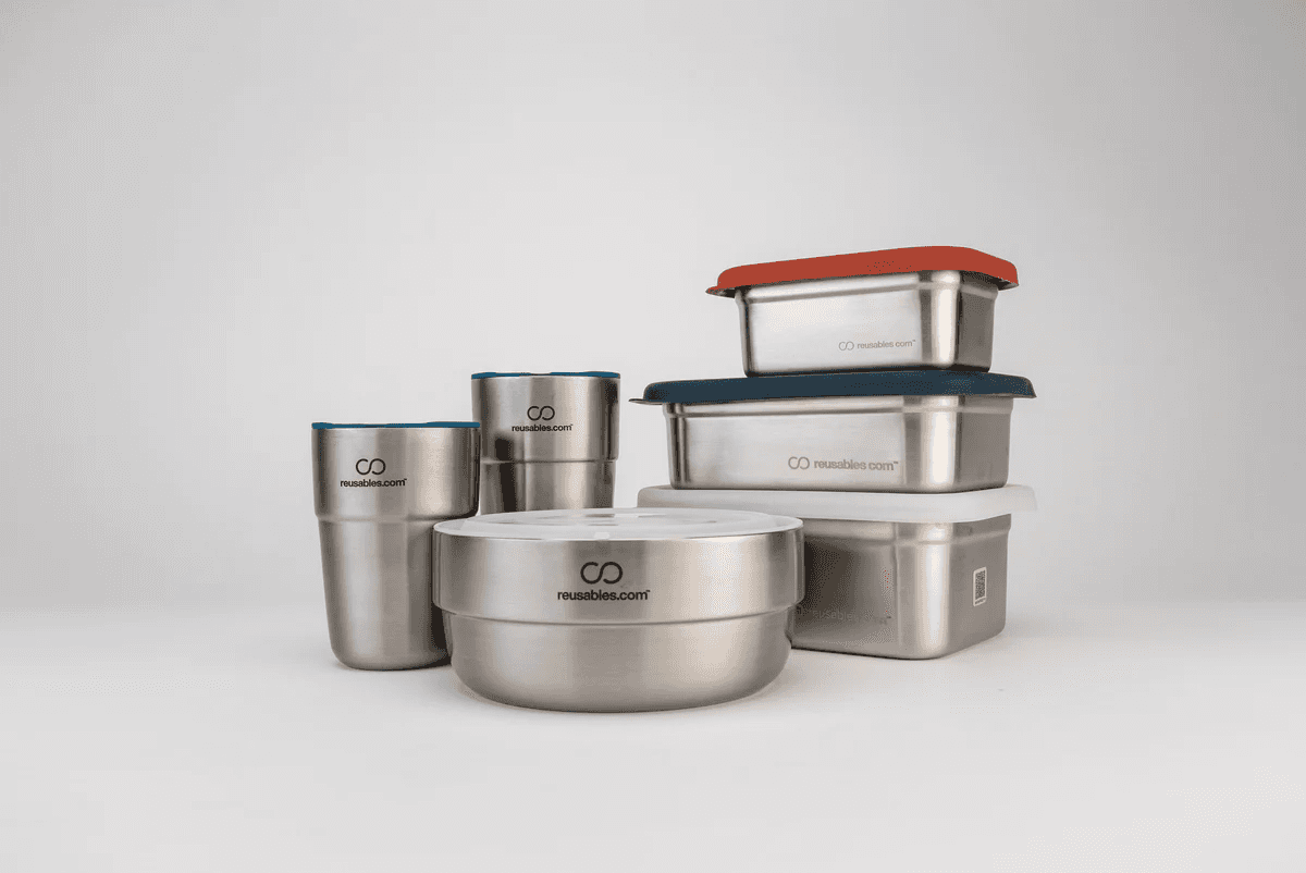
Reusables is a container-borrowing service that operates in campuses and restaurants. Their supply food services with reusable containers to reduce the use of single-use packaging waste.

THE PROBLEM
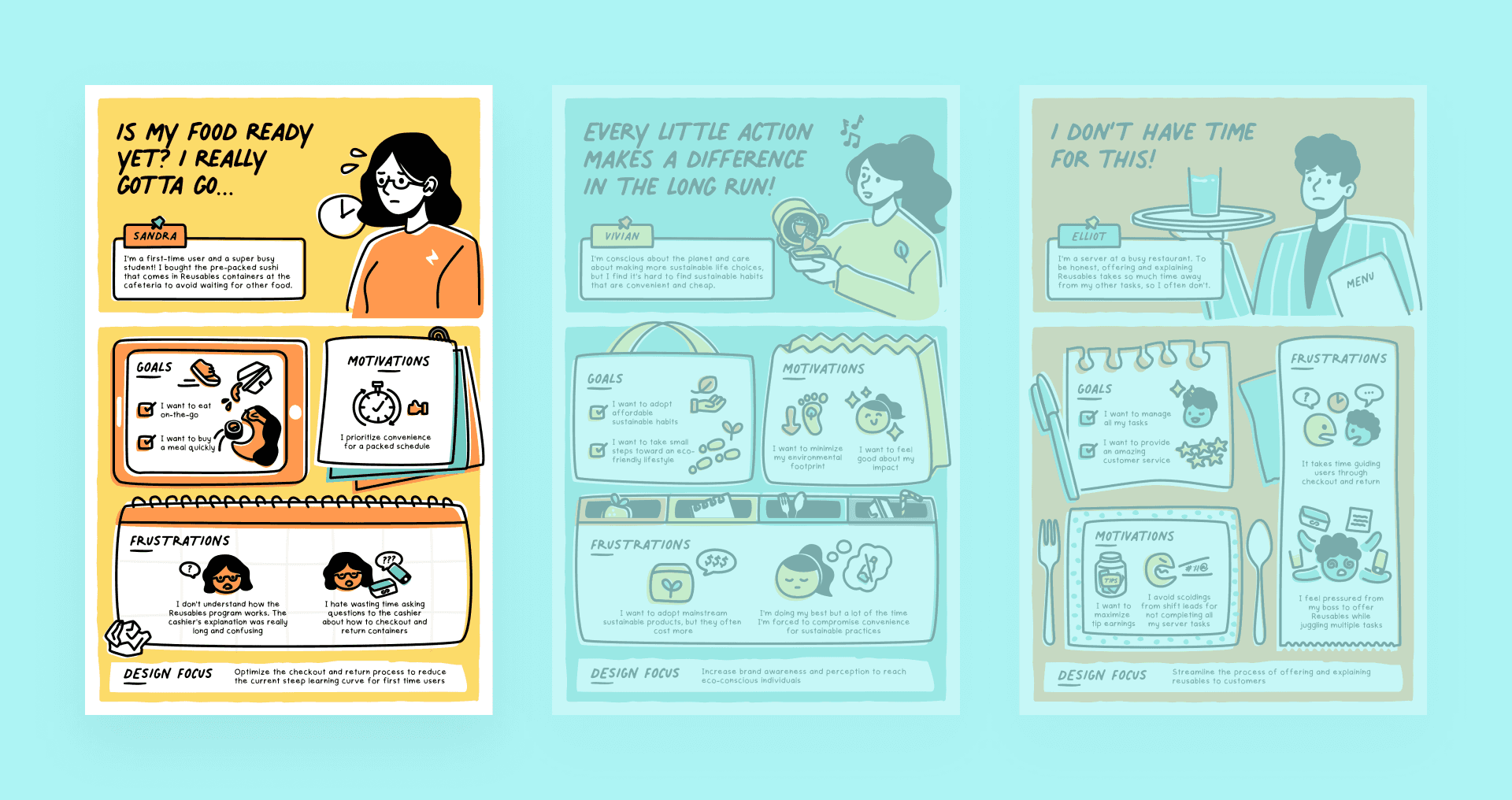
New users find the borrowing process inconvenient, which discourages them from participating in the program.
INTRODUCING
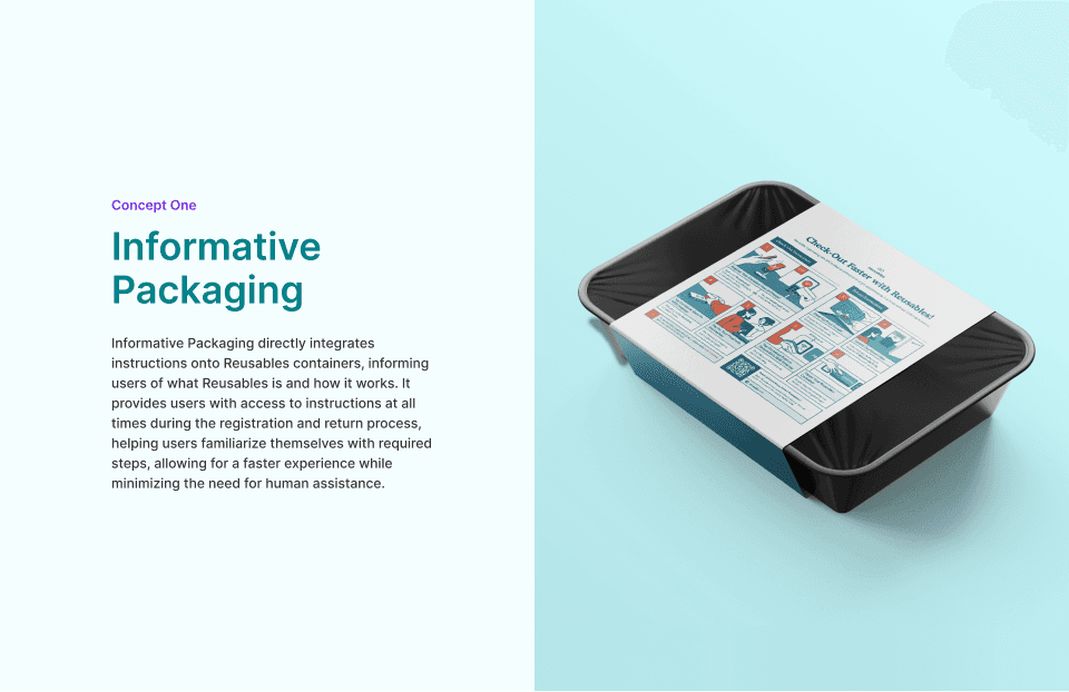
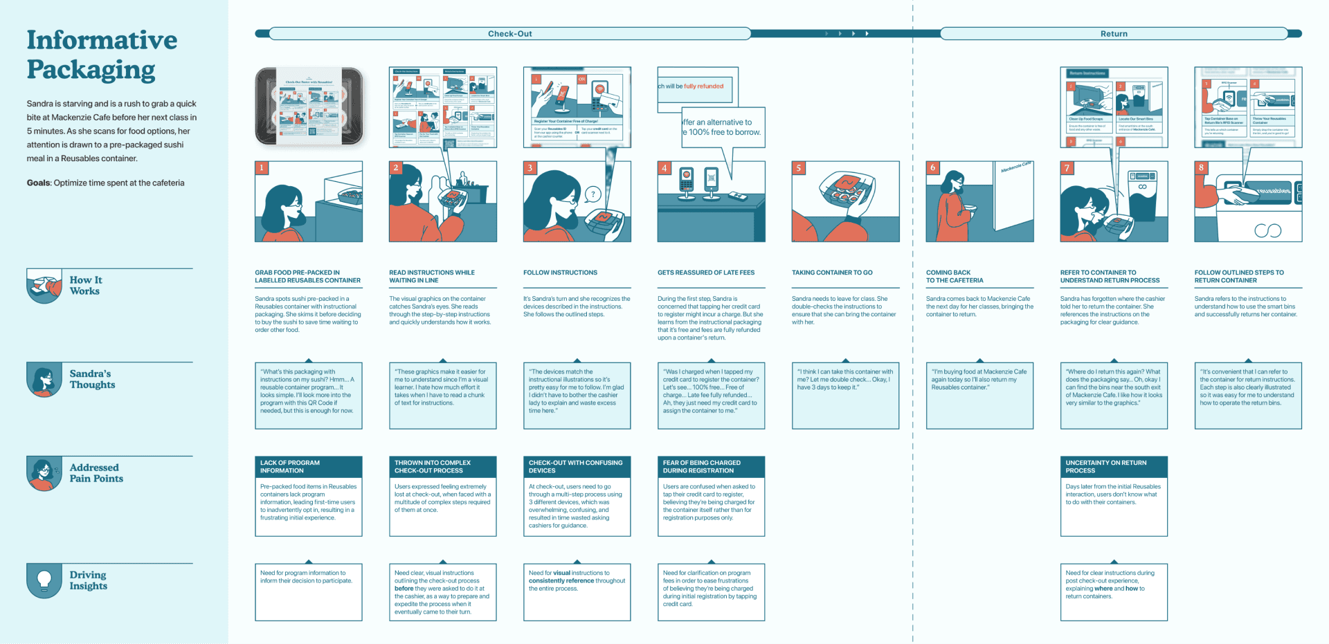
The Reusables Vending Machine


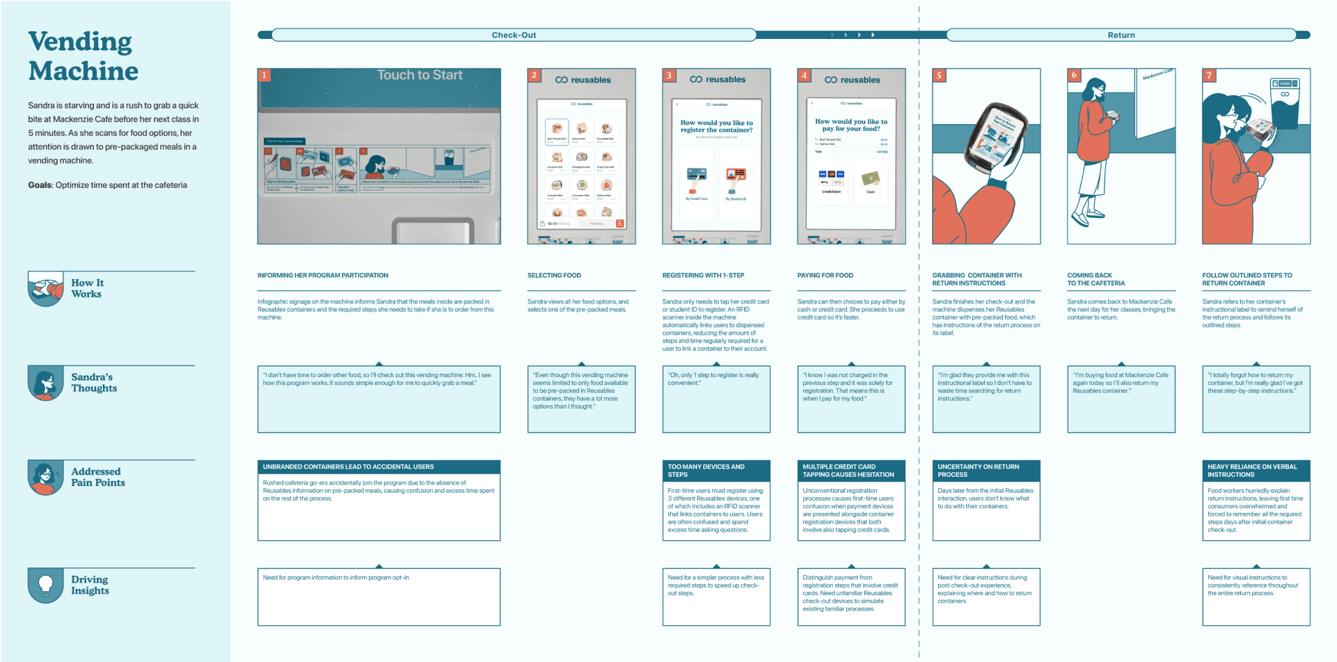
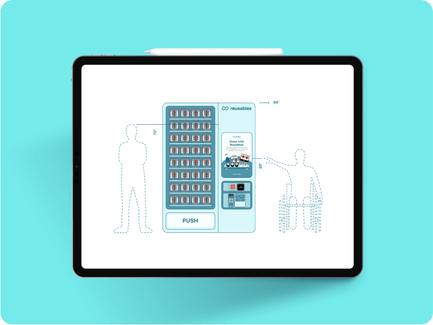
VENDING MACHINE
Informing the pre-ordering experience.

Pain Point
Unbranded Reusables containers lead to first-time users to opt-in the program unknowingly. Users are often unaware they need to check out the container or how to complete the process
Solution Impact
I designed visual instructions so that users are informed of the program and have a consistent reference point throughout the borrowing and return process.
LCD SCREEN INTERFACE
Single-step registration.
Pain Point
Users face a multi-step checkout process which leads to confusion. Additionally, verbal instructions from staff are often unclear and hard to remember.
Solution Impact
The interface guides users through a clear and intuitive checkout process. This reduces confusion and minimizes steps.
LCD SCREEN INTERFACE
Differentiating payment from container registration.
Pain Point
Unfamiliar registration devices are placed near similar-looking pay terminals. Many users mistakenly believe they’ve completed the process after paying.
Solution Impact
I redesigned the user flow by placing checkout before payment along with step-by-step guidance. This helped reduce confusion and ensured users completed both actions.
RETURNING CONTAINERS
Informative packaging as a return guide.


Pain Point
Days after using Reusables, users often forget how to return their containers. They have to ask staff again, which takes extra time.
Solution Impact
I designed an eco-friendly, dishwasher-safe sticker placed directly on the container to provide clear return instructions for users.
HOW DID I GET HERE?
UX research and design process

IMPACT
What is the outcome of my research efforts?
Driving Program Improvements
Our findings are being used to inform the design of clearer workflows and improved onboarding for new and first-time users.
Amplifying the Customer's Voice
My research increased awareness and understanding of user pain points among Reusable stakeholders. This helped ensure that real customer needs were prioritized in future product and service decisions.
RETROSPECTIVE
Final reflections and learnings.
Understanding users with design ethnography
Despite reading about the system beforehand, it wasn’t until I observed and went through the full experience that I fully understood the confusion users face. Ethnography gave me a new perspective and helped me address existing pain points rather than assumptions.
Adapting on the Fly
During our participatory workshops, I found that some activities took much longer than initially planned. I learned to quickly adapt by prioritizing activities that generated the most valuable insights, making on-the-spot decisions to trade off lower-impact exercises while still ensuring we collected meaningful data from participants.
Navigating Differing Perspectives
Within our team, the vending machine emerged as the favored solution. While I supported the goal of improving first-time user onboarding, I personally leaned toward concepts more closely aligned with stakeholder priorities, such as a kiosk or other solutions that empowered restaurant staff without significantly altering the existing business model. In a team setting, it was important to balance my own perspective with the consensus of the group.
This experience taught me how to navigate design disagreements constructively, advocate for stakeholder-aligned ideas, and still contribute meaningfully when the chosen direction differs from my own vision. It also reinforced the value of establishing alignment between user needs, business goals, and team enthusiasm early in the design process to avoid larger trade-offs later on.